
For my first project, my team and I worked on branding for the Health Innovation minor at Fontys. The client wanted us to inspire and educate students about the potential of health innovation. By showcasing the value of the Health Innovation Minor, you aim to create a pathway for students to explore cutting-edge solutions in healthcare and drive change in the healthcare sector.
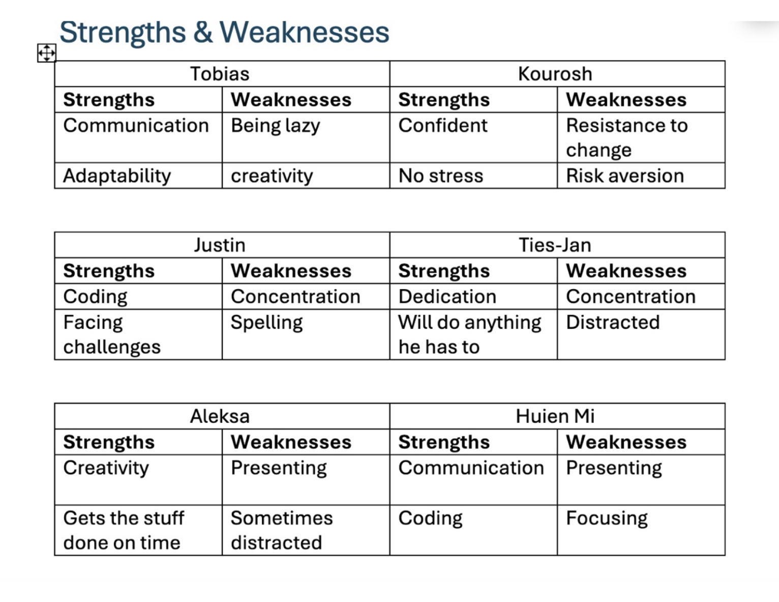
The first week me and my teammates had the task to make an Excel table with our own strengths and weaknesses. That way, we all got to learn more about our group and how to divide the upcoming tasks in the project by knowing each other's strengths.
Next, we started off by making the project plan. We all took part in creating it by brainstorming and giving ideas of what to create for the project. Everyone volunteered for different tasks, sharing what they are good at or want to learn. We not only planned the week ahead but the following ones as well.
After that, we moved on with the content strategy. We divided sections among ourselves so that everyone had a part. I helped present the forms, letting our client know what the mission and vision are.
My teammate Miya created a Trello board in which I helped her organize tasks. We assigned tasks to everyone and prioritized them, determining when they should be completed.
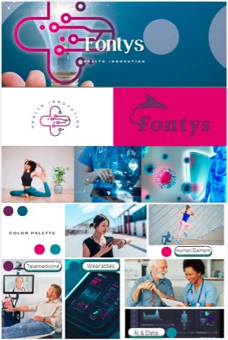
Later in the first week, we already started working on the stylescapes. We divided the group into two smaller ones, pairing me with Miya and Justin.
The three of us made our own designs and then combined them into a shared one with our own touches.
Before starting anything, I researched what stylescapes are since it was my first time working with the concept.
I learned that it is a type of post combining same-themed images of the brand you are promoting. I searched for images connected to health and decided to use blue instead of green,
since the Fontys’ logo is purple and I felt green wouldn’t work well with it. I also made a poster for the project, focusing mainly on the color blue to give it a more tech-like look.
Although I wasn’t entirely happy with the end result, it was a valuable learning experience, and I’d like to improve it next time.
After the stylescapes, we created logos for the client. Again, we started working individually and discussed which one would be the most suitable. My goal was to create something simple within the color palette we selected. I was inspired by plus signs on Pinterest because they convey positivity. I chose light blue as the main color for my logo to make it stand out and be more noticeable. The result was a simple, memorable design that the client could easily use on other products.

Next, Miya created a survey , and I helped with designing and distributing it. The survey focused on the appearance and content of the website that she and Justin were building for the project. However, we received feedback from Frank, who suggested that questions about website colors weren’t necessary. Instead, he encouraged us to trust our own design decisions as creators.
One of my favorite tasks was creating the promo video . I was excited because I’ve always found video production interesting. I started by researching Google for general guidelines, then moved to TikTok for tutorials and inspiration. I noticed the importance of grabbing attention early and making the video feel less like an ad to avoid being skipped. I found a green-screen phone video and worked with CapCut and InShot to create the video. Although it took time and patience, I was very happy with the final result. Our client was pleasantly surprised by the promo video and expressed that they would use it.
Finally, I worked on the project presentations. I created two – one for the initial feedback session with the client and another for the final product demonstration.
Before starting, I reviewed the client’s provided information, researched health innovation, and explored the Fontys website for additional insights.
After gathering enough information, I used Canva to design presentations with health-related visuals. I kept the layout simple yet engaging,
using the project’s color palette and simplifying text for better readability. I then divided the slides among my teammates, ensuring they were comfortable with their assigned sections.


Click the link below to download the project documentation:
Download Word Document